Within the inundation of my card collection amid the chronologically boxed and bound are a polarizing lot identified as parallels. In a nutshell parallels in the collection world include varying color schemes, textures, imprints, or conceptual designs that match the order of the basic set. Most differences are obvious.

Some are not.
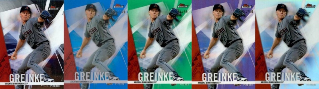
The 2013 Topps above were my introduction to parallels – I own the base and red, while the blue is NOT (presently) on my Want List. There are others, technically 27 other parallel variations if you include mini-cards and printing plates in the 2013 Topps Baseball set. In some cases you’re probably safer discussing politics than bringing up your latest parallel acquisition. Old school collectors despise the idea that card companies have brazenly thrown wrenches into their completist mentality. For the 2013 set, one smaller by about 130 cards than releases in the past five years, that would mean needing 17,820 cards for a master set! For comparison a 1985 Topps Baseball master set with every insert totals 1,667 cards. Let’s talk Biden/Trump to keep it civil instead.
Alas, the seed was sown in me so I’m inclined to reap in my own way. I’ve labeled it a parallel intersection. It’s slightly outside the box thinking, but at its core, not really, and typical for me as I tend to go against the grain when witnessing lemmings heading for cliffs. It’s more because I dislike my hobby being determined for me by others, not that any of you would ever do that as this is purely hypothetical.
I do seek normal modern parallels, just not the overly-hyped serial-numbered pay-out-of-the-wazoo kind, though I will not pass one up if its value is not jacked up. But the targeted intersecting parallels cross sports and brands. My general focus is thematic in concept or design, and I really enjoy finding those across brands, though the majority will be amongst various sports within the same company’s products.
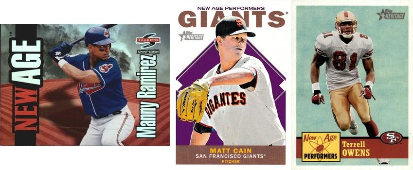
One of my primary collection targets are the Topps Heritage New Age Performers inserts. They began in 2001 (the series, not my collection of them) and continue through 2023 (and hopefully with 2024 product). Despite being programmed to reject anything New Age, I quickly embraced Topps’ New Age Performers series with their retro style. I believe they were aimed at 1960s hippie baseball fans, especially those who now sport much less hair. While collecting those sets I ran across Score’s Summit – New Age offerings and despite their disoriented horizontal format (see Sides Matter), they are part of my collection. The Summit parallels seem to capture the spirit of New Age with their mystical design.

In 2018 Topps Baseball reintroduced the Legends in the Making series, and for the record they continued their polarizing colored background parallel in which I do indulge somewhat as a deeply-seeded lemming (only getting close to the cliff; a chicken-type game. How’s that for a mixed metaphor?) As for the collection I discovered Legends in the Making in the 2013 Topps Football set recently. The graphics are more artsy in baseball, while in football they have a medieval bent. For the record, my second one in this paragraph, there are plenty of sets and subsets with the “legends” label, and they don’t qualify as a parallel in this case. Remember, for the record – numero tres – this is MY collection.
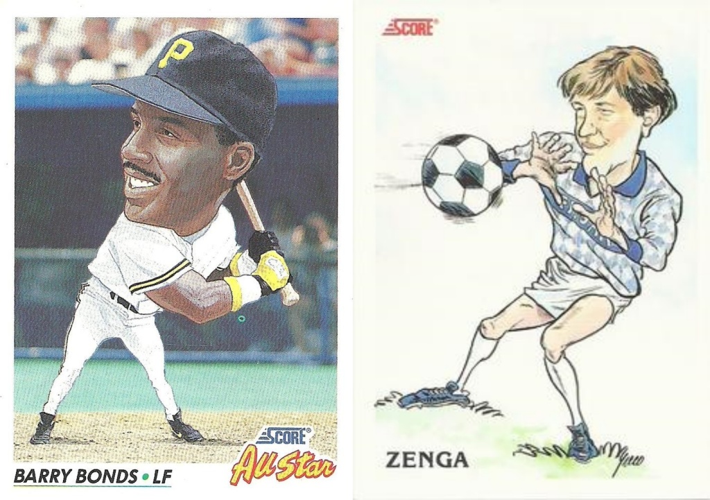
If there ever was a case identifying me as a card collector and not an investor in the hobby it would be this parallel intersection collection. I don’t follow soccer, much less the Italian League, but I do collect cards and when I found these put out by Score it was a match made in Heaven, not the Vatican despite it being Italian. I believe it’s the same artist’s work as the chicken drumstick template for human legs is used. (That’s my second reference to chickens in this article. It must be the delicious baked chicken with asparagus with a butter and garlic sauce that my wife prepared for us last week. I’m now in the mood to score some Italian, possibly next Sunday with friends after church. Maybe chicken cacciatore?) Back to the cards, the players’ lean and upper torso is similar. Two differences I see in this parallel is the background stadium in the baseball product while the soccer is open air space. The other is Bonds’ head. It seems bigger than normal; we’ll leave it at that.

I shared that I’m not a soccer fan. Well, I’m also not a hockey fan. BUT, I AM a card collector. The Kellogg’s Keepers of the Cage are a favorite set in my collection. They are a basic picture of the goaltender’s mask with the team name in bold print against a black background. A few weeks ago I found some trade matches with a partner in Finland with whom I’ve traded before. My modus operandi is to scour a member’s trade list (assume only on TCDB.com) as I enjoy discovering foreign product. I found inserts called Mad Masks in the 1998-99 Cardset Finland Hockey set that Antii had for trade. They match up well with the Keepers of the Cage on the parallel intersection.
The parallel intersection increases the pleasure of the hobby for me. It begs for my attention in that I believe nothing is in isolation. There’s an interconnectedness in all. I do still prefer my interpretation of a parallel to the recent manufactured colored ones, though I will venture into those, too, for I am not an investor, I identify as a card collector.

Leave a comment